
DiapaROO
A bright, friendly website for an all-in-one diaper changing travel kit: it shows what is inside the kit in seconds, tells the brand story and makes it easy for parents and retailers to get in touch.
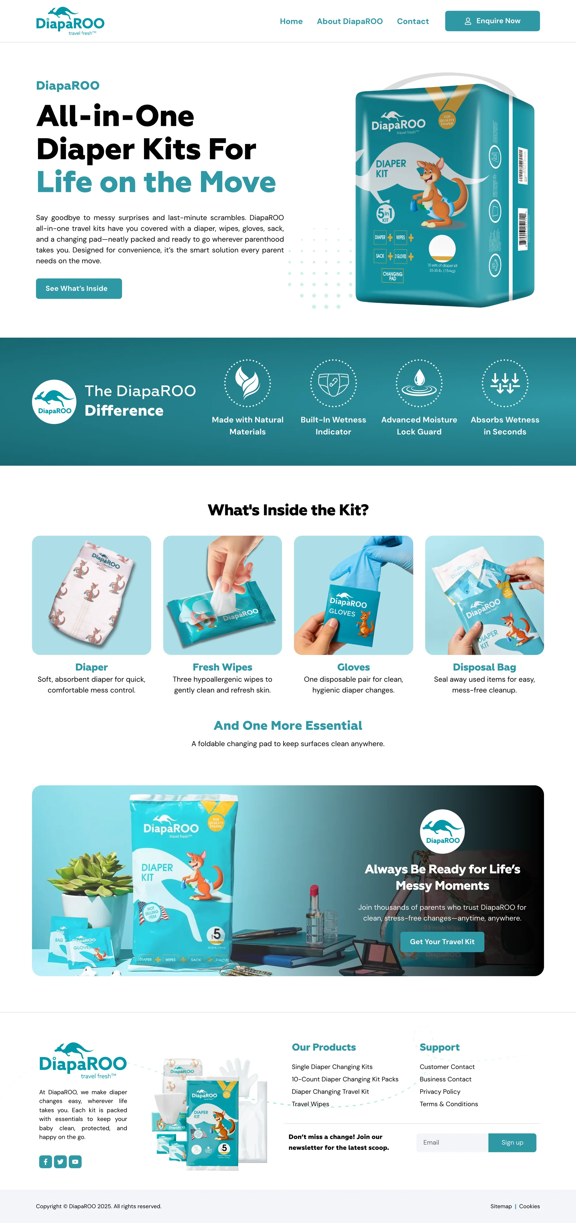


Hover a screen to scroll the page
Overview
DiapaROO makes all-in-one diaper changing kits for parents on the move: a diaper, wipes, gloves, a disposal bag and a foldable changing pad, packed into one pouch.
I designed and built the website on WordPress and Elementor around the product’s own packaging: the kangaroo mascot, a fresh teal palette and clear product photography, with a homepage that shows what is inside the kit, an about page for the brand story and a contact page for customer and business enquiries.
- Client
- DiapaROO
- Industry
- Baby care products
- Location
- United States
- Year
- 2025
- Services
- Website design
- WordPress development
- Product presentation
- Contact and newsletter forms
Built for every screen
The same site, laid out for each screen. Drag the edge of the window or pick a device. Hover the screen to scroll the whole page.
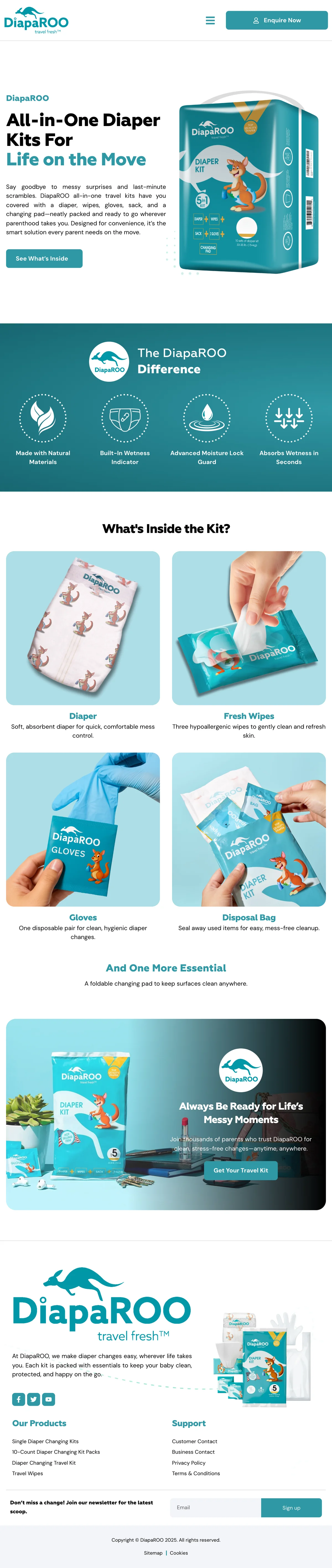
On real devices


The challenge
A new product in a crowded baby care aisle has seconds to explain itself. Parents had to understand what DiapaROO is, what comes in the kit and why it beats packing a bag, while retailers and partners needed a clear way to reach the brand.
A new product to explain
Visitors had never seen a ready-made changing kit before, so the site had to show the contents rather than describe them.
Trust with parents
Anything for babies has to feel clean, safe and well made from the first screen.
Two audiences
Parents want to know what is inside; retailers and distributors want a business contact.
A brand from packaging
The site had to carry the look of the pouch and box so the product feels familiar on the shelf.
Explain the kit in one glance, make the brand feel friendly and trustworthy, and give parents and retailers an easy way to get in touch.
What I did
The homepage opens with the kit itself and one line that sums it up: all-in-one diaper kits for life on the move, with a button that jumps straight to what is inside.
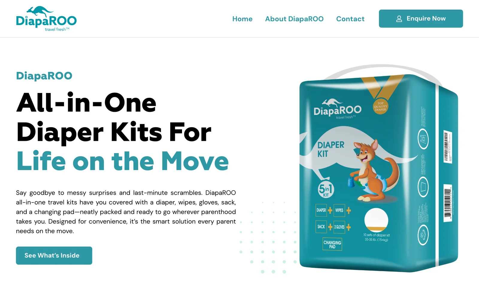
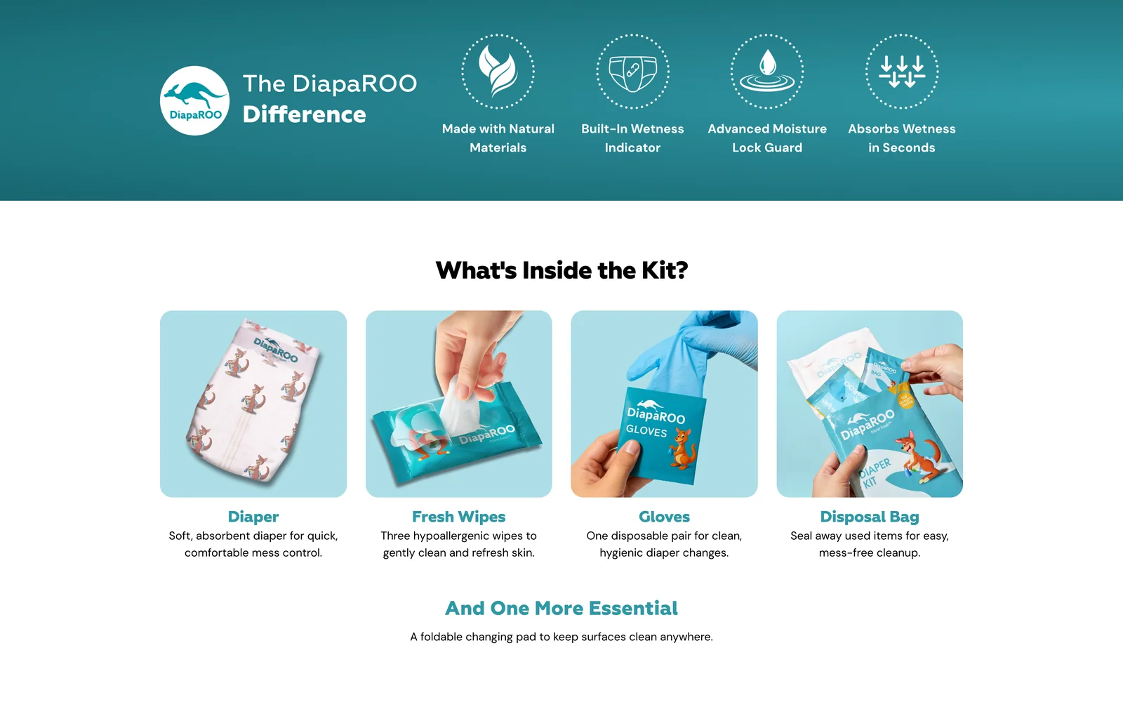
A teal band lists the product's key features, then each item in the kit (diaper, wipes, gloves and disposal bag) gets its own photo card, with the changing pad as the final essential.
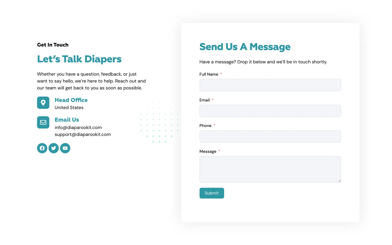
The contact page pairs the head office and email addresses with a short message form, for parents, retailers and partners alike.
Brand
Taken straight from the packaging: pouch teal for headings and buttons, sunny gold and fresh mint as soft accents, and plenty of white so the product photos stay the hero. Headings use Geometria and body text DM Sans.

The pages
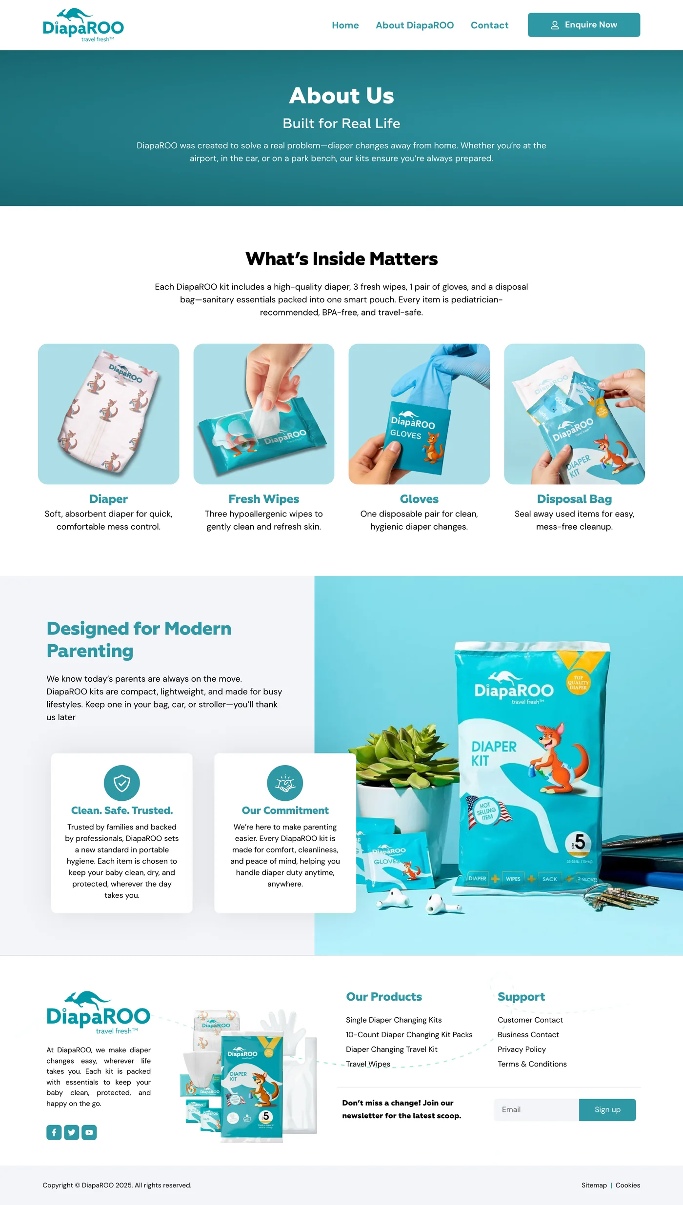
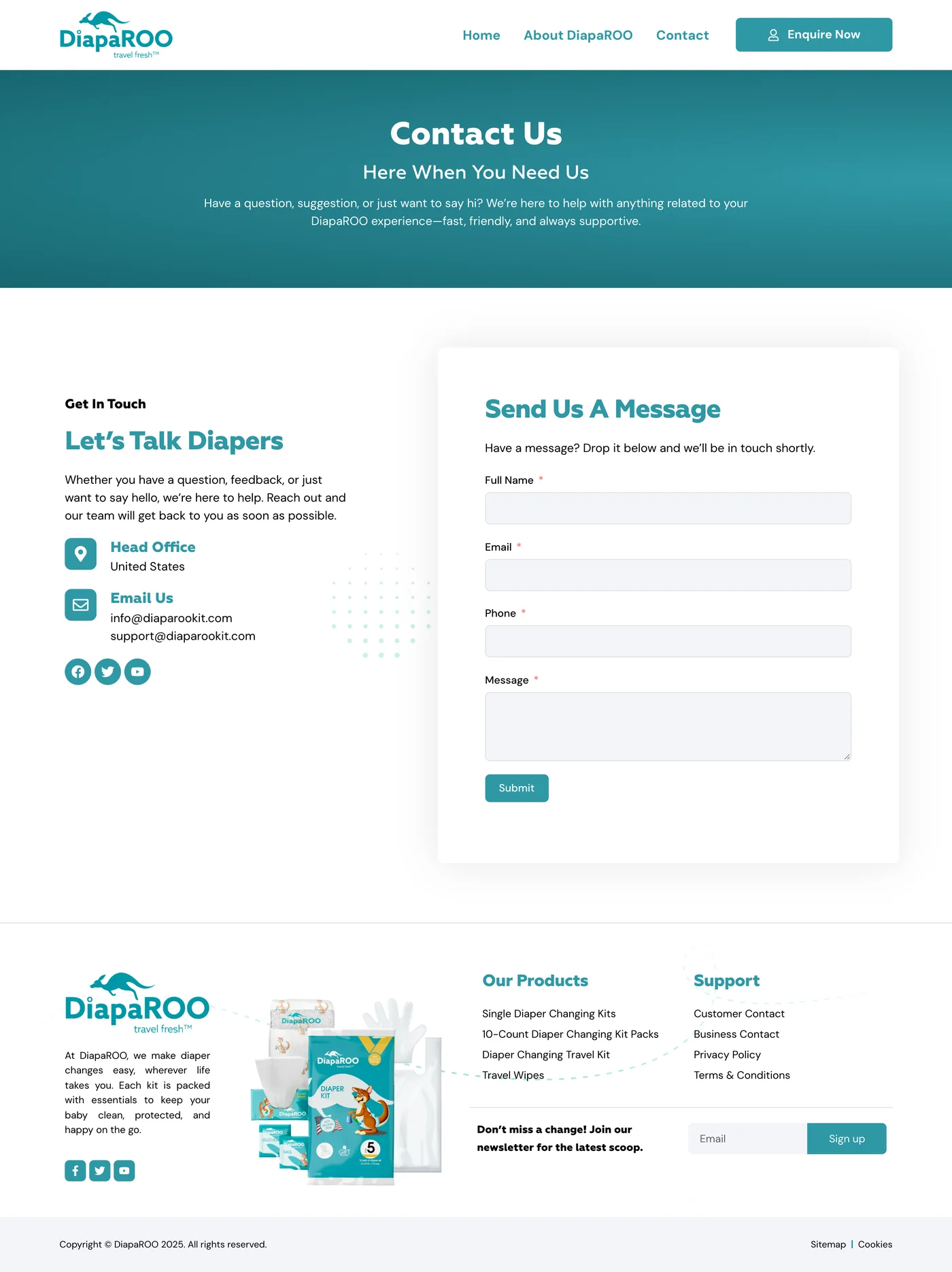
Pick a page, then scroll inside the window to explore it from top to bottom.
Results
essentials, each shown on the page
Diaper, wipes, gloves, disposal bag and changing pad, each with its own photo and one-line benefit.
focused pages
Home, about and contact: everything a new brand needs, and nothing it does not.
brand from box to browser
The kangaroo mascot, teal and gold from the packaging carry through every page.
What it means for the client
- Understood in seconds
Photos of each item explain the kit faster than any paragraph.
- A brand parents trust
Clean layouts and soft colours feel safe and approachable.
- Ready for retailers
Business contacts and a simple form make wholesale enquiries easy.
- A list to grow
A newsletter sign-up in the footer builds an audience for launches.
The stack
The tools behind the build, and what each one does on the site.
- ElementorEvery page layout, from the product feature band to the kit cards.
- WordPressPages the brand can update as new products launch.
 Fluent FormsThe contact form and the newsletter sign-up.
